10 Guidelines To Improve Your Web Accessibility
We put together a list of ten web accessibility guidelines that will guarantee access to your site to any person, in spite of their disabilities.
 There’s a quote by Tim Berners-Lee, Director of W3C and inventor of the World Wide Web, that says, “The power of the web is in its universality”. As people who make a living by making websites, it’s our responsibility to ensure everyone has access to them. Web accessibility seems like a tall order on paper, but it’s definitely much easier than it sounds.
Our ten web accessibility guidelines are designed to ensure that all websites are universal.
This will not only help screen reader users, but will also improve browsing experience for slow connections. We’ve sorted our guidelines by implementation time to give you a clear picture of just how much effort you’ll have to put into this process. Before you get overwhelmed, take our word for it—it’s totally worth it.
First things first:
 What the heck is Web Accessibility?
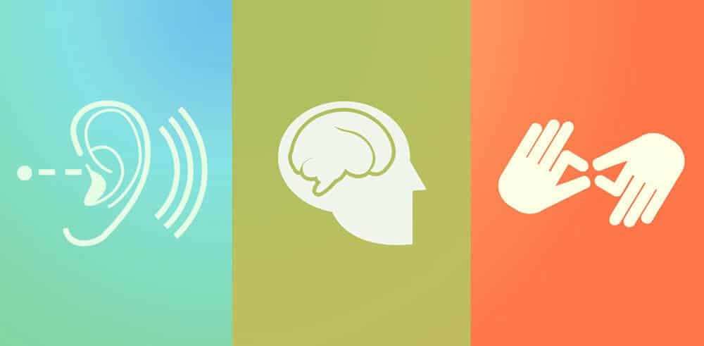
According to W3C, web accessibility means that every person can perceive, understand, navigate, interact with, and contribute to the web. In this regard, website accessibility encompasses all conditions that affect access to the web, including visual, auditory, physical, speech, cognitive, and neurological disabilities.
You’ll find a bunch of content on this topic around the web, and you should really look deeper into the Web Accessibility Initiative (WAI) if this topic interests you.
With that in mind, here are our guidelines:
1. Do not depend on color (~ 45 minutes)
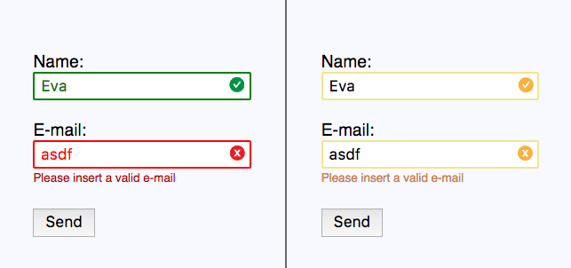
Color is a powerful tool we often use to express emotions and communicate messages on the web. However, we shouldn’t put all our faith in color to convey meaning and information to our users.
Why?
For example, it’s widely known that green means “right” and red means “wrong,” but what happens when we use this as our only mean of communication?

If we display important messages in our user interfaces using only color to convey information, we are leaving 4.5% of the population behind.
Color should complement an error or confirmation message, but it cannot be the only tool we use. In order to be certain that we reach all our users, we should always add labels or icons that display whether filled information in a form is right or wrong.
A very interesting solution was adopted by caniuse.com, which provides an alternative color palette to display the content of their compatibility tables.

It is ideal to check for color blind and contrast while designing, so make sure that you and your design team have the right tools. We highly recommend the Stark plugin for Sketch that helps you design with accessibility in mind!
2. Do not block zoom (~ 5 minutes)
In the age of responsive design we might have made a few irresponsible mistakes.
One of these is the apparition of maximum-scale=1.0, which disables the functionality to zoom in on web pages using mobile devices.
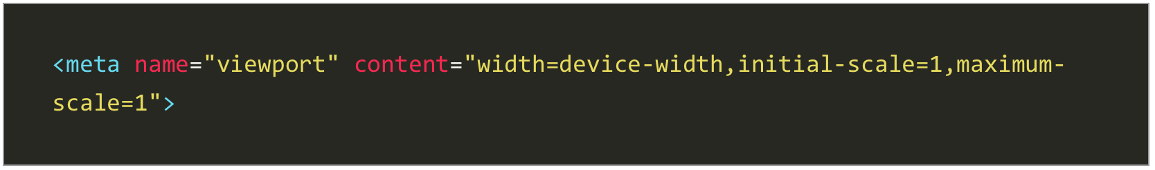
Astigmatism affects between 30 and 60% of adults in Europe and Asia, but blurry vision can affect people of all ages and nationalities (Hi mom!).
The ability to zoom in is not just another whiny WCAG guideline, but a tool to simplify everyday life for these people. So next time you are building a responsive website remember to think of my mom every user with blurry vision.
Besides making it possible for users to zoom freely on mobile devices, remember to also check that your layout looks good at up to 200% zoom in desktop browsers ?
3. Rediscover the alt attribute (~ 45 minutes)
No matter how long you’ve been making websites, you might be surprised to know these few tips on the famous, yet mysterious, alt attribute.
- The alt attribute is compulsory to every img tag but an empty alt attribute is completely valid. If an image is decorative or not necessary to understand the content of the page you can simple use alt=””
- Screen readers tell the user that an
tag is an image so there is no need to be redundant and begin your alt with “Picture of”; just go straight to the point.
- The function of an image is as important as its meaning: if your logo links to your website’s home page then your alt text should be something like ”Home Page” instead of “Logo.”
- Alternative text is not just about accessibility. Sometimes users with slow data connections disable images to achieve a faster browser experience. Have those users in mind whenever you write your alt attributes too!
But not all images in your website are img tags, right? You might have an SVG or two around there…or a whole SVG icon system.
How do we make SVG accessible for everyone? Luckily for us, the Scalable Vector Graphics standard has us covered! In order to describe our vectors we have theand tags for short and long descriptions.

4. Add subtitles and captions to your videos (4+ hours)
This might be one of WCAG’s most difficult guidelines to achieve, not because of a technical difficulty, but because it can be time consuming. There are a few ways to get this done:
- Let’s take YouTube for instance. Once you upload a video to the platform you can enable closed-captions. These are automatically generated and might turn out to be inaccurate in some circumstances depending on the language, background noise, or the speaker’s accent. Nevertheless, these are very easy to implement and can work well on most English-speaking videos.
-
If we are looking for 100% accurate captions it’s hard to trust YouTube to come up with good copy, so we must write the captions ourselves or hire a third party to do so. YouTube will take the most common subtitle formats (.srt, .sub, and .sbv) as well as letting us write the subtitles on the platform itself, which can be very convenient if we don’t own any subtitle software or if we wish to ask our community to help us translate the content without giving admin access to our account.
- But perhaps you don’t want to use YouTube as your hosting platform. Perhaps you wish to use an HTML5 video hosted on your server. We’ve got you covered! HTML5 includes the tag, which you can use to easily attach as many caption and subtitle files as you like using the WebVTT format (Translations FTW!).

5. Semantics = accessibility (~ 45 minutes)
Font tag, remember? I hope you don’t, those were dark times.
In spite of common belief, semantics weren’t born with HTML5. They have been with us since the first HTML page and have greatly improved since then. With the HTML5 standard, new semantic tags are introduced for our everyday use.

Ok, but isn’t semantics just for SEO?
Not necessarily. When you consciously choose an
tag over a
or a , you are deliberately changing the meaning of an element, providing hierarchy, and building a tree structure of your page’s information.
Screen readers are not oblivious to this. In fact, semantics is one of its most useful weapons.
Keep in mind that with great power comes great responsibility, so make sure to use the proper semantic tag for each element, from h1 to the brand new main tag.
6. Use the right mark-up (~ 30 minutes)
As a follow up to the previous point I’d like to discuss a few false friends and controversial pairs:
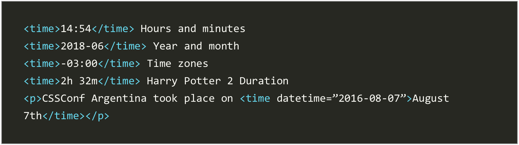
Time vs. Datetime
The time element displays many types of date formats, time zones, and durations using the ISO 8601 standard to represent dates and times.
Datetime is an optional attribute that helps represent the content of
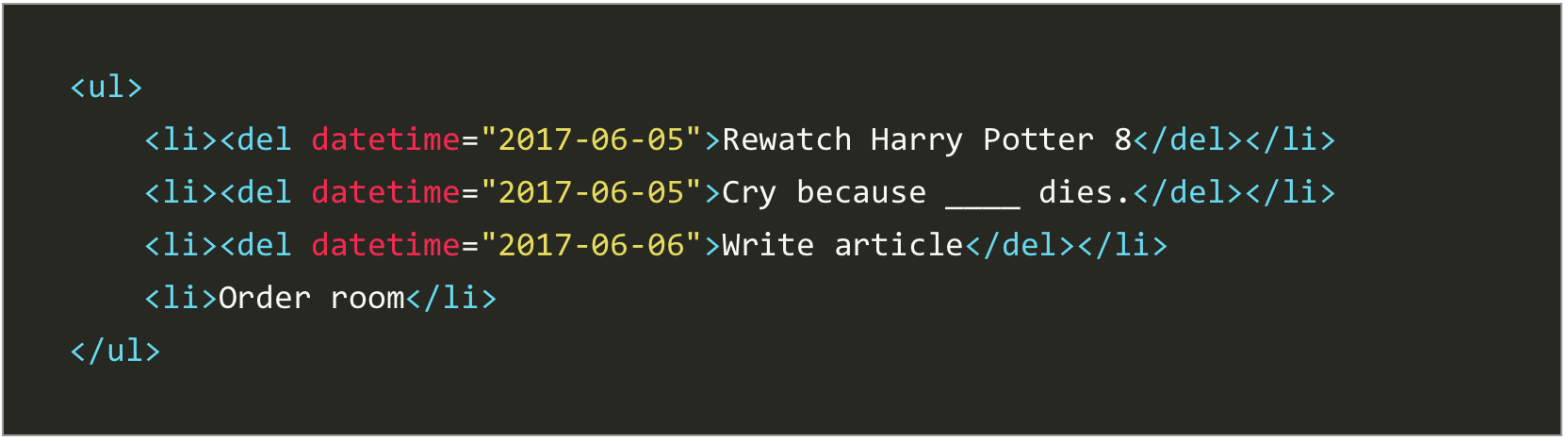
Del and Ins
The web changes constantly, but there’s no need for those changes to go unnoticed. We can mark edits using the ins and del HTML tags in combination with the datetimeattribute.
The ins element represents an addition to a document:
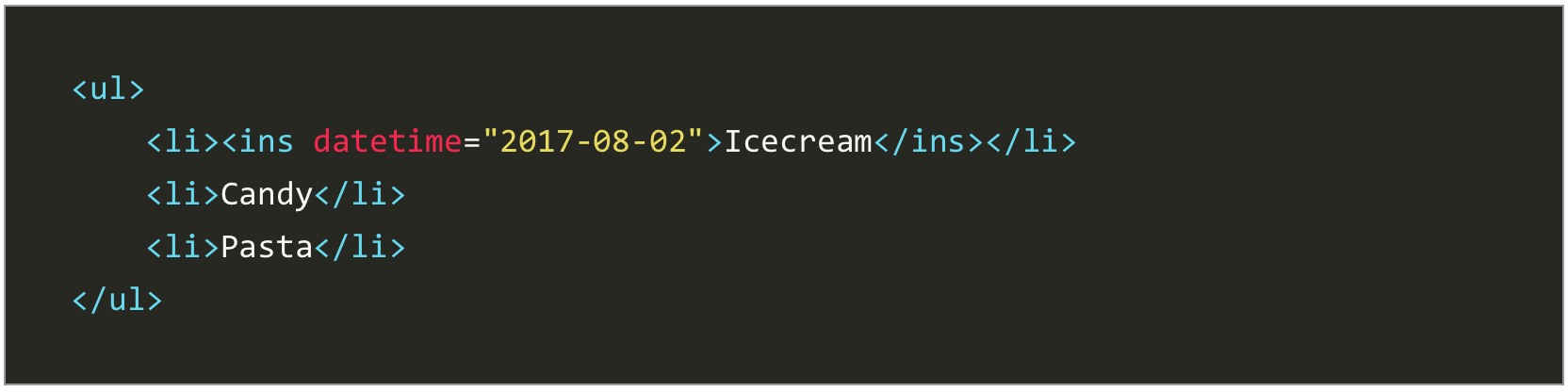
The del element represents deleted content:
Button vs. tag
Get the popcorn, this is a good one. When should we use each?
Let’s see:
Also, the button tag can be easily confused with the input type=”button” but the difference relies in the former being able to take more content (text, image + text or only images).
There are two things to consider when using the button tag:
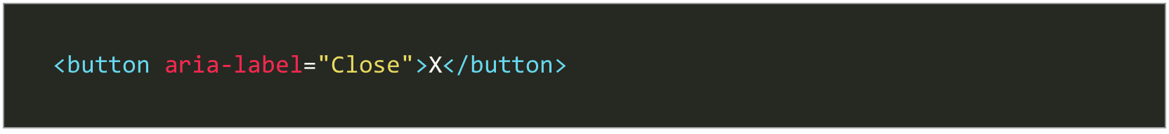
First, if the content of a button is not explicit enough (take an “X” in a close button for example), we must add an aria-label attribute to help explain the function.
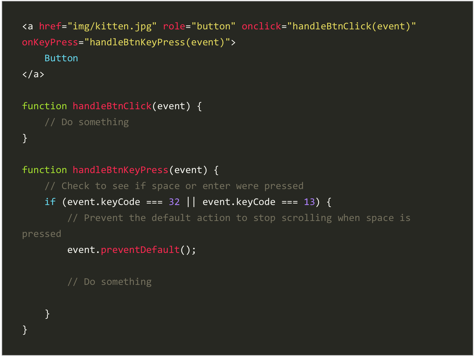
Second, if adding an href attribute makes sense (a search component or a lightbox gallery), then we might as well use an a tag and override the link behavior with JavaScript. An image gallery that uses a tags with href will degrade gracefully if JavaScript is not enabled.
But…
7. Use roles when necessary (~ 1 hour)
In order to tell screen reader users that our link triggers an action and it is not, in fact, an ordinary tag, we must add the role attribute with the value “button”.
But beware!
When writing your JavaScript you need to call your functions not only on click but also when the user presses the spacebar. This is necessary because the behavior used for buttons is different from the one used for links and the user should be able to trigger the action on either of these commands.
Read more about this on MDN.
Bear in mind that aria roles are not usually necessary unless you break the rules, like in the example above. HTML semantic elements have a default role already applied: “navigation” for the
![]()